CASE STUDY - 2019
Simon

ROLE
UX/UI, Researching, Prototyping
TIMEFRAME
48 Hours
TOOLS
Figma, Sketch, Illustrator, Premiere Pro
TEAM
Samanta Hansel
Monique Lopes
Chanelle Miller
Overview
Most freelancers will often rely on five different apps just to stay organized and be able to properly time manage their projects. At times it can feel impossible to satisfy every client when you don't have the budget for a personal assistant.
As a team of university design students who juggle school work and client work, we could relate to the struggles one faces when being able to meet tight deadlines and keeping clients satisfied. With three ambitious women and one goal, came the desire to create an app that helps freelancers become more organized and properly time manage their projects. Our common stresses led us to the inspiration of having an app that functions similarly to having a personal assistant with the freedom of voice commands.

Problem
A common problem we noticed is many freelance designers will attempt at managing their time with school and work along with other personal projects leading to skipping over tasks and missing deadlines. With several apps out there that help freelancers track hours spent on a project, creating invoices, scheduling meetings, following up with clients, and breaking down large projects, there isn't one app that helps designers simplify all these essential steps for them.
HOW MIGHT WE,
Create an easier and more efficient experience for freelancers that helps them manage their projects and stay organized?
Solution
Our solution to referring to various apps, we integrated an AI assistant. He will be right by your side through every step of the way. This app will include built in features that will assist you in problem areas such as scheduling meetings, organizing emails, sending invoices, etc.
By formulating a benchmark analysis we decided to team up with Toggle, a time management app to save time and to use an app that many people are familiar with.

LIKE OUR SLOGAN SAYS...
Getting tasks done one by one,
with the help of Simon!


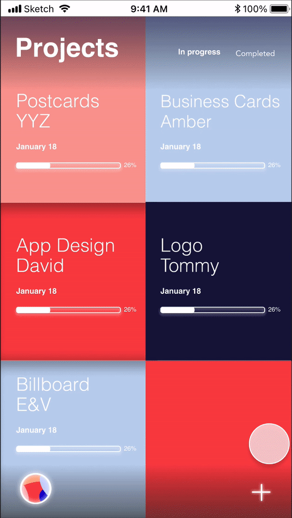
A Breezy Projects Page
One of the common takeaways from our user research was that our buttons were very small and the overall appearance was dull. We elevated the projects' page by making the projects into colourful squares mimicking the look of sticky notes and increasing the size of all the elements. The projects page will tell users how far along they are, the deadline, and the title of the project.


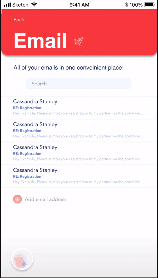
Emails in One Place
It can be confusing when you have emails coming in from different accounts, so we put them all in one place for you. Users can add clients and instantly, past threads and conversations between the user and their clients will appear in the email section.

Easy and Fun Onboarding
We wanted our users to quickly understand all that the app can offer before signing up with four simple slides. We kept the copy minimal and incorporated illustrations to engage the user quickly.

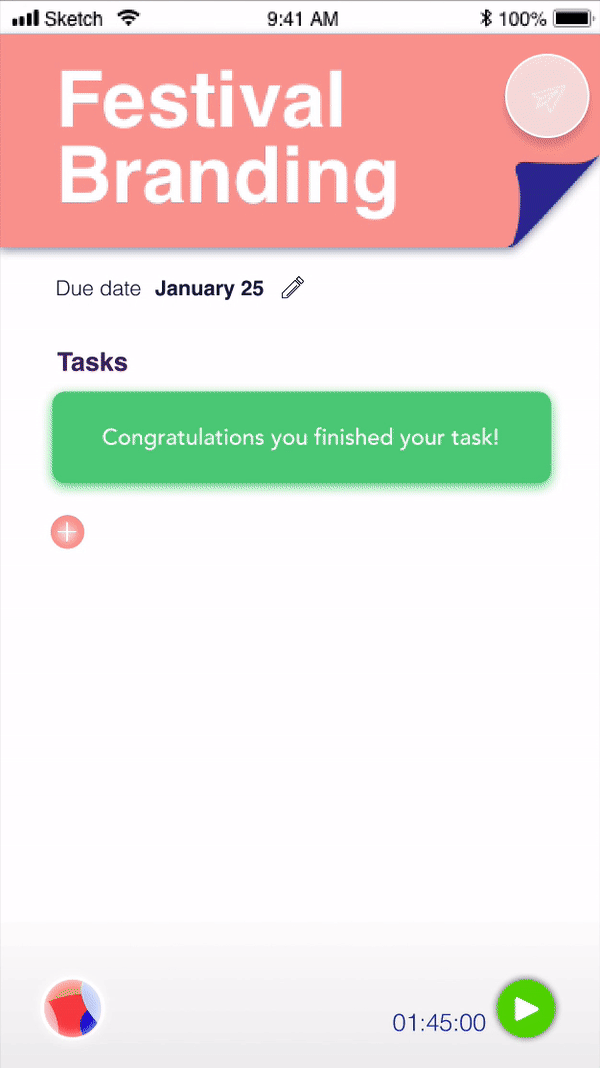
Adding Tasks
We included all the basic essentials when it came to adding tasks within projects. We found this helped users overcome procrastination by breaking down each project into smaller steps. In return, users experience less stress when they take this stride.

Never Miss an Event
The calendar will let users know all their upcoming deadlines and events in the current and following week so they won't forget. Users have the option to put in their commute time so that the event can prepare them early to make any event on time.
Your Own Personal Assistant
Based on user feedback we modified Simon by making the background more transparent so that users can still connect to the app. Also Simon's messages along with the user's messages appear when responding so that the user knows if Simon is listening correctly. Within the settings of the app, users have the option to change the pitch of Simon's voice to be able to personalize their own assistant.

Research & Emphasizing
As a student and freelancer, I understood the frustrations more designers face when it came to time management and tackling all the small components that cause stress. Although, I wanted to further understand the opinions of other freelance designers of all sectors. Therefore, our team created a PACT Analysis to help better visualize the scenario.
But, why a male AI?
Right from the get go, we wanted to create and make the AI a male assistant. Most of the AI's we interact with have a female voice command like Siri, or Alexa. This was brought to my attention at a design conference and inspired our group to test and research more into this concept of the difference between male and female AI's. A challenge we realized we would face is having to properly test our AI and receive feedback. We then used the DECIDE framework to create our user test plan which helped guide us.
User Personas
Name: Matthew
Gender: Male
Age: 22 years old
Scenario: Mathew is a recent graduate design student and he is looking to freelance but is having trouble organizing his time with his busy schedule at his other job helping out the family raspberry farm business.
He is looking to have an app that will help him organize his time and help find different job postings near by. Also due to all the raspberry picking, his hand and fingers get very sore from helping out his grandparents so having some sort of speech option would be ideal so he does not have to type as much. Also, Mathew is quite nervous looking for freelance jobs because he has never worked in freelancing before so having some sort of guid or navigation through the app to make things simpler or a country boy would help him out a lot.


Sketching Out the Bad Ideas First
We started by sketching out the plan using the MoSCoW rule to determine what the present and future goals of the app would be. This helped us narrow our design process. We then started the projects page, calendar, and what the AI command would look like.


Interaction Map

Mid-High Fidelity Mockups
We started by designing the functionality of the website with more detailed and visual mid-fidelity mockups. We made sure to do a thorough job in this process to assure an easy transition into the high fidelity mockups.
Adding a Project


Adding, Editing, & Completing Tasks

Staying in Contact with Clients
Planning with the Calendar

Creating the AI
We wanted Simon to embody what the typical designer would look like and someone reliable, with a face that users would not be hesitant to use for assistance. Our first attempt at the AI, we originally named him Jack. Although through conducting our user test we changed the name to Simon.
Illustrations made by Monique Lopes


But how will we user test a fake AI?
We tested our first AI with a usability test by reading a script to our user testers and asking them a few questions. Although we felt that the feedback wasn't that accurate since it was female voices reading the script. Our solution to our first attempt was showing a video of a user interacting with the AI and having the user write a letter to Jack. To view the full user report, click here.
First Attempt

Final AI
Branding a Fun Workflow
We believe that creating a flexible and joyful design language to strengthen the overall experience creates a meaningful relationship between our users and the app. We decided on vibrant colours that would appeal to our majority female audience along with a standard font that designers easily relate to and recognize. The brand concept was inspired by elements of project managing such as sticky notes.
To view the full style guide, click here.

Primary Colour
#E6514F
RGB 90, 32, 31
CMYK 0, 65, 66, 10
Primary
Colour
#C3D3EC
RGB 76, 83, 93
CMYK 17, 11, 0, 7
Secondary Colour
#6A81C0
RGB 42, 51, 75
CMYK 45, 33, 0, 25
Primary
Colour
#EFA29B
RGB 94, 64, 61
CMYK 0, 32, 35, 6
Secondary Colour
#16153D
RGB 9, 8, 24
CMYK 64, 66, 0, 76

Helvetica
Bold
Icons

Simon Speaking

Branding Elements
Reflection
This project has taught me the beauty of collaboration and has broadened my perspective to new ways of critical design thinking. I've worked alongside very talented peers and we really started to see the magic come together during those long nights of bouncing ideas off each other and having fun with the assignment. I also learned to ask as many questions about ways of designing to help evolve the end result.
This experience has taught me many ways of incorporating various design strategies into my process. During this project, I learned how to formulate a Benchmark Analysis, PACT Analysis, the DECIDE framework, MOSCOW Rule, and the Feedback Analysis, which really helped our team come together and make important decisions.
"Alone we can do so little, together we can do so much."
